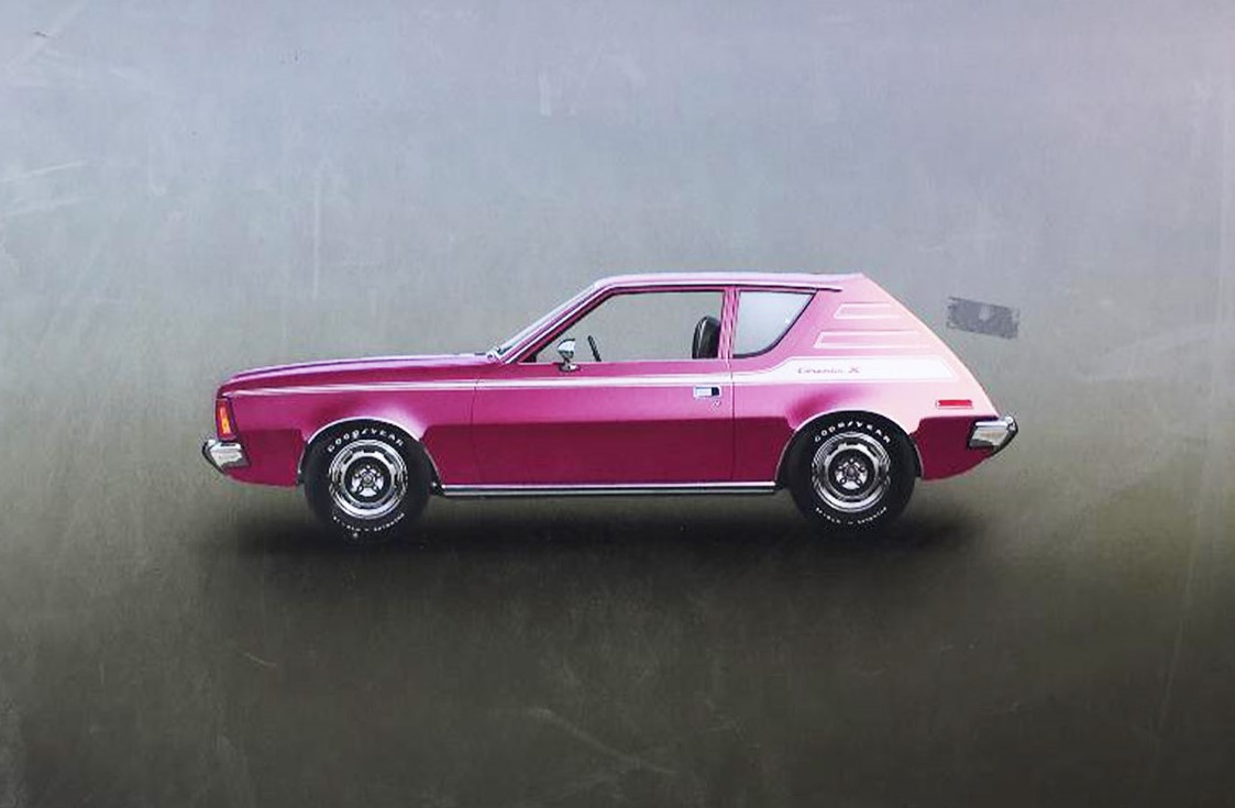
With small imports taking over the subcompact car scene in 1970, American Motors decided to roll out a car that was not only small but stylish. They decided on a design, a silhouette that would become The Gremlin. While stylish isn’t usually the word people use to describe a Gremlin, it certainly was unique.
Interesting Beginnings
Strangely enough, the Gremlin was launched on April 1, 1970 (source) and was allegedly designed by Richard Teague on the back of an airsick bag while flying back to Detroit (source). In order to compete with the VW Beetle, the Gremlin needed to be reliable, affordable, and also a car with a distinguishable design that Americans would be proud to own. (source) To keep costs down, Teague built the Gremlin using parts that were interchangeable with several other American Motor cars, most notably- the Hornet. (source)
Leaving the Competition in the Dust
In contrast to its subcompact competitors, the Gremlin came standard with a 6-cylinder engine, making the powertrain one of its key selling points. (source) These particular engines had earned a reputation for being reliable and durable, not to mention affordable. (source) Because of these competitive advantages, over 670,000 Gremlins were sold in 8 years. (source) That’s quite a tidy profit off of one of the world’s ugliest cars. (source)
But It Has Character
If you ever owned an AMC Gremlin, or perhaps spent a good amount of your childhood riding around in one, this piece will really brighten up your collection. Visit our Gallery to purchase the one and only Gremlin.
About the Piece
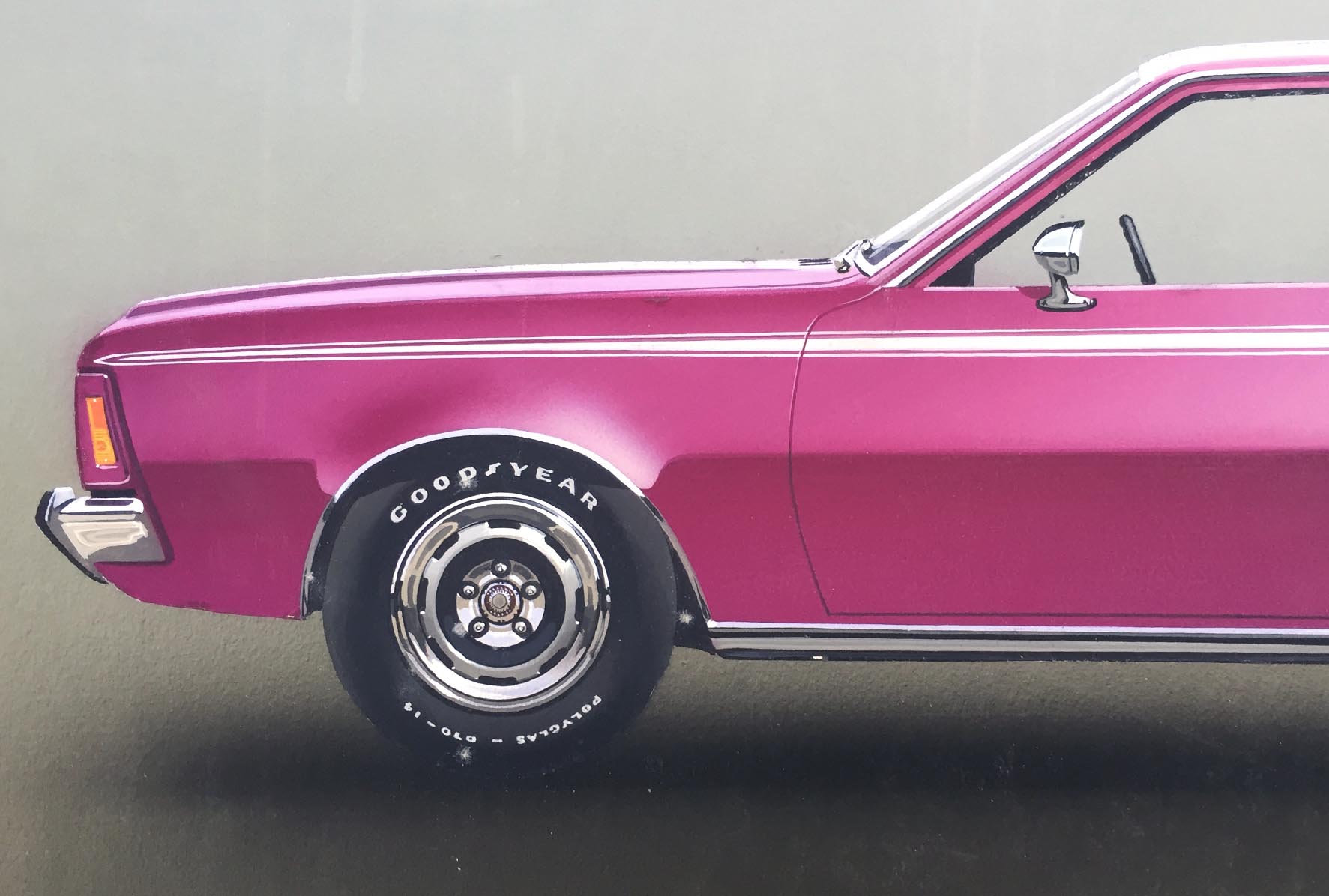
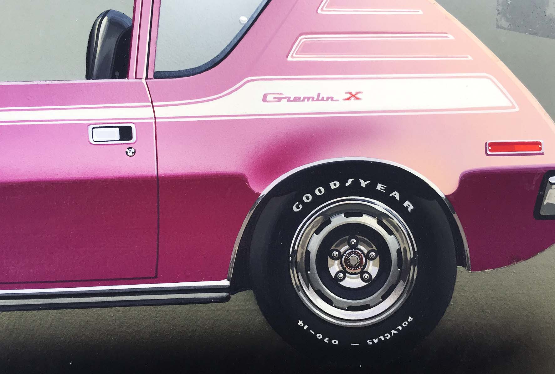
Once a car is designed and moves into production, artwork is needed to illustrate the car to potential buyers. This photo-realistic painting of a 1970 Gremlin appears to be an example of brochure artwork. At first glance, many viewers assume they are looking at a photograph of the car. However, this piece has been airbrushed by hand.
About the Artist
This particular piece was created by an unknown artist, adding a touch of mystique to an already unique subject.


