Image Source – McDonald’s Media Library
When you think of fast food, what comes to mind? More than likely, it’s McDonald’s. McDonald’s restaurants are undeniably an American classic. Travel into just about any town and you will see the familiar sign inviting you in for a burger and fries. However, McDonald’s is not only known for its food. Believe it or not, it’s also known for its architecture.
Speedee Design
In order to highlight the quick service that made McDonald’s famous, they needed a store design that would both allow for speed of service and catch the attention of hungry customers. The McDonald’s brothers hired Stanley Meson who created the original building design in 1953. Dubbed “The Red and White”, Dick McDonald felt the roof was too flat and had the iconic Golden Arches added. The Red and White design lasted for about 16 years, but some are still operational today.
The Mansard Roof
In 1969, franchisees began transitioning their restaurants over to the Mansard Roof Design. This new adaptation of the traditional Mansard Roof, in contrast to the Red and White, gave a more sophisticated feel to the restaurants. While this style of restaurant is still in existence today, it has undergone many updates since its inception. However, the Golden Arches remain only in the signage.
Upgrading and Modernizing
In recent years, McDonald’s has attempted to rebrand itself to appeal to a younger generation. From McHives to implementing sustainability initiatives, this classic American brand is making some changes for the better.
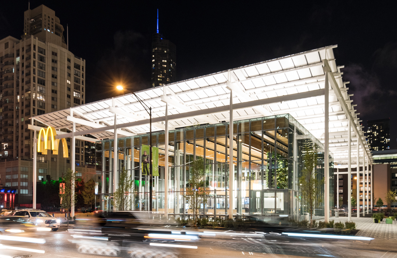
As a matter of fact, one of these changes is at the McDonald’s global flagship store in Chicago. It is getting a surprisingly modern and clean facelift. No more brown and beige textiles. Instead, Ross Barney Architects have designed this building to include “cordless phone charging, a mini-arboretum with harvestable apple trees, and 27-foot windows to keep them and the whole interior well-lit”.
It appears as though McDonald’s is going back to its mid-century roots. In addition to simplifying operations, the brand is also simplifying its architecture. Time will tell if these changes are enough to reclaim its spot as the top quick-service restaurant. In any case, these new restaurants will look good trying.
Add Industrial and Architectural Pieces to Your Collection
If you are looking for the perfect piece to begin, or add to, your own art collection, visit our GALLERY. We have beautiful, original mid-century modern pieces by Raymond Loewy, Vincent Raney, and others.


